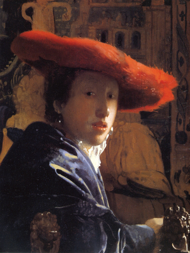
This isn’t a photo, it’s a painting by Vermeer called ‘The Girl in the Red Hat’. Hopefully you’ll see why, for me, it has a lot to do with photography.
Out of all of Vermeer’s paintings (I think there are only 34 that are undisputed), this one looks most like an image produced by a camera obscura. With the aid of a lens, a camera obscura allowed the user to project an image onto a wall in a dark room.
There’s no definitive decision on whether he used the camera obscura to compose his paintings, but the kind of images they produce have a similar intensity of colour and contrast. You can see too, from the soft points of light on the carving on the arm of the chair, that the image has qualities characteristic of a short depth of field. It is as if the brush strokes submit to the language of a lens, allowing its vocabulary of focus and blur to determine the vocabulary of the painting.
Making the important parts of an image those with the highest contrast was not a new thing, but the lens also provided the effect of a shallow depth of field. Instead of avoiding the effects of blur and focus, Vermeer was able to use it, in conjunction with contrast and colour, to tell us where to look. The crispest points of light hover on her bottom lip.
(Velazquez notably used a similar technique of a sort of sharp/soft focus in the way he directed the viewer in his paintings. Though the function is the same, they have a more painterly and less lenticular quality – it is possible that he also used a camera obscura)
So, have a look at the picture and I’ll tell you about two tricks I was told about when learning to paint. The first one is to de-focus your eyes, so that everything goes blurry. This makes it a lot easier to see colours as they are. For instance when a white has a particular hue, it can be very difficult to perceive, so this often helps.
The other trick is to narrow/squint your eyes so that they are almost closed. This helps you see relative tones. Darks and mid tones seem darker than normal, the lighter tones stay similar. If you do that and look at the painting, you’ll see that tonally it is mainly very similar, and quite dark. That is apart from her face and a few other bits (her hat is a midtone, her hand, edge of the chair).
The light side of her face and her collar is the brightest part by far. It’s a streak of light right across the middle of the painting. This, to me, is a radical (and beautiful) portrait. What has been placed at the centre is not a person, but a patch of light.
In its emphasis on the incidental – its relaxed composition, its snapshot-like candour and this emphasis on light – Vermeer pre-empts qualities in the work of Degas, who was himself very much influenced by photography, and the work of Cartier Bresson. Later still, William Eggleston, with his ‘democratic camera’, giving colour and form equal, or sometimes greater, importance than content.